Kate has a variety of architectural experience, from focusing on office design (whilst working in London) to detailing high-end houses back in New Zealand. Kate is a registered architect and member of the NZIA. She has been a Professional Teaching Fellow and critic of Design at the University of Auckland (School of Architecture). She has judged the NZIA Local Architecture Awards, Interior Awards, and the World Architecture Festival and appeared as a Guest Expert on TVNZ’s Our First Home. Kate has a love for interiors and furniture, has renovated her own home and built her own award-winning house.
Showcase
Home Sweet Home
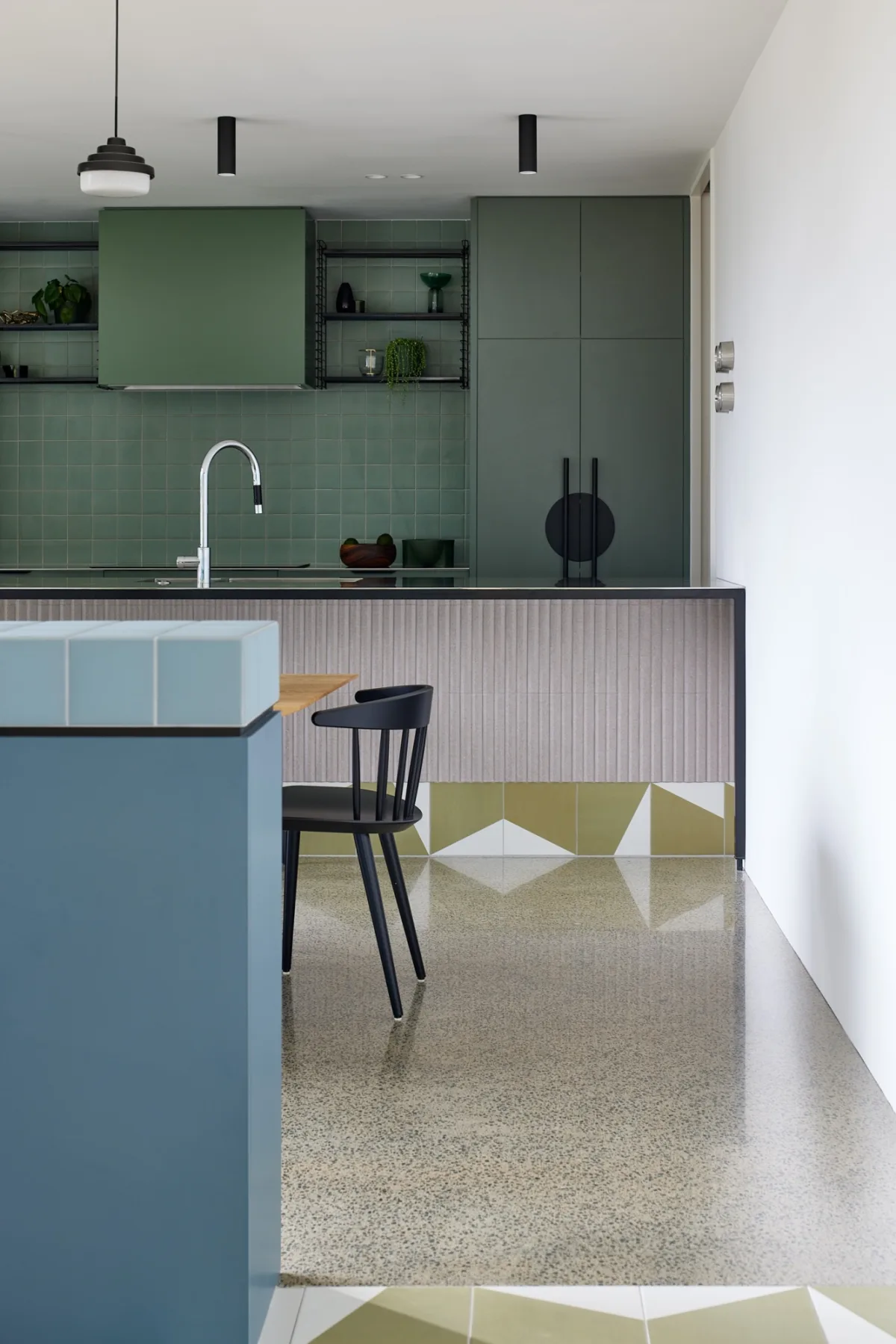
The client, a family of four, wanted us to provide an interior which was playful and not all white. They were really keen on the concept of colour blocking, and wanted us to interpret this in the interior scheme. The trick was to make sure the home still felt cosy and suited to family life.
To add cosiness, and going against the grain of open-plan living, we developed an interpretation of a broken-plan concept, where the interior layout has some degree of separation but is still connected with: cosy nooks and enclaves, including a dining sideboard (used to separate the Dining and Living rooms), and window seat.
Clever use of colour-blocking delineates the interior. Graphic olive and white Mutina tiles immediately set the tone at the entrance. There is different colour of cabinetry in each space throughout the home. Bold patterned wallpapers add vibrancy. We chose every element in the interior scheme: from cabinetry, paint, wallpaper and tiles to cushions, rugs, accessories and artwork.
The colours were chosen to feel mismatched yet pleasing. The overall tone is one of nostalgia – familiar and homely, and a nod to the clients’ grandmother who had a colourful mid-century British design aesthetic. For the color palette we referenced colour blocking as it is seen in the world of fashion, for example the collections of Missoni and Diane von Furstenberg. For the tiling to the island bench we looked at the tiling of traditional European 'Milk bars' (where there is often a juxtaposition of differing tile selections).
The use of tile reflects this sense of comfort. The Mutina tiles in the entrance are repeated in a walkway through the living area to the deck, and they are also wrapped around the base of the kitchen island.
The Dining sideboard in the dining area is finished in 70s-style square tiles. A circle motif, for example in Bankston Supermoon cabinetry hardware and pendant lighting, softens the geometrics and extensive use of Tomado shelving cements the old-school feel.
The home has been awarded a Homestar for Design and Construction.
Year of Completition
2023
Type
Residential Architecture - Single House
Role
Architect (designed with Eva Nash)


