Phoenix is a Registered Architect who comes from a background of high-end residential architecture working on projects all over New Zealand. She lead the design for beautiful homes, renovations and interior fit outs.
Most of Phoenix's projects have been exclusive and private. However, she is excited about bringing her skills and knowledge into the public realm.
She is an appreciator and seeker of beautiful things, this is combined with an extremely practical and technical background as Project Architect.
Outside of work, Phoenix enjoys entertaining and cooking for her friends and family or trying out all the new cafes and restaurants to indulge the foodie in her.
Showcase
Comvita Flagship Store
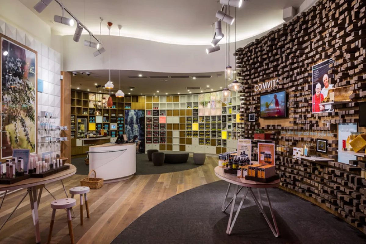
Comvita is a hugely successful New Zealand Export brand with around 480 retail outlets worldwide, predominantly in Asia. Products include natural health and beauty products mainly formulated from honey and olive leaf. (Comvita own the world’s largest olive grove.) This prototype flagship is a model for on-going – mainly international – rollouts. It reflects Comvita’s simple and natural approach while also telling their brand story.
The small (96m2) interior, designed to accommodate large tour groups, was divided into 3 zones: The “Story Wall”, composed of recycled Rimu timber houses iPads and a video screen along with various static images to explain the origins of the Comvita brand and its natural focus. The beauty wall consists of dozens of shallow pyramids as an understated backdrop to Comvita’s new line of skin products. Health products are housed in pigeonholes arranged in a semi-circle at the rear of the shop. These allow for easy segmentation of a variety of products while the form hints at beehives. Flooring materials and ceiling forms further help to define the spaces. The “Life Lab” at the rear of the store allows customers to try products and facilitates product demonstrations. Counters are deliberately small and curved to avoid blocking customer flow in the tight space.
The result is a subtly coloured and textured environment of organic forms that reinforces Comvita’s completely natural brand image while positioning it as a premium retailer of natural health and beauty products to a wider audience.
Photo taken by: Patrick Reynolds
Year of Completition
2013
Type
Retail
Role
Project Architect
