A detailed eye, masterful organization and technical know-how are all essential skills for a delivery architect, and Bojana bring them in spades. Two decades in architectural practice has shaped Bojana into a seasoned delivery lead, and with a large portfolio across retail, commercial, residential and mixed-use environments to her name is no surprise why. Her down to earth nature and signature style to solving challenges with ease sets her apart as a reliable and approachable team player, and earns her the respect of consultants and clients alike.
Showcase
NorthWest
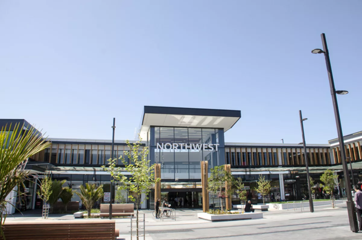
Situated in an ideal location with a growing customer base, the NorthWest Shopping Centre is part of a larger, comprehensively masterplanned North Massey Town Centre (NMTC) for West Auckland with easy access from the Northwestern motorway .
As part of the new town centre, the phase one area known as Zone 5 comprises an enclosed mall with a two level Farmers Department Store at one end and a Countdown Supermarket at the other. There is an extensive area of car parking above the main mall area plus on-grade parking accessed directly to the north of the centre. The uniqueness of the development is the integration of main street retail with the traditional shopping centre model, creating synergy with one feeding off another and providing a unique, new shopping experience. As part of the street-based retail we have also created four separate (in appearance only) buildings which define the street frontage and flank the main entry to the mall. These buildings have retail at street level with an additional level of offices above.
With great emphasis being placed on articulating the Maki Street side of the development as part of the CDP requirements, the result is a dynamic, animated building façade as a backdrop to the busy main street retail environment Maki Street has aspired to be. Entry statements from Maki Street into both the Town Square and car park add texture and grain to the building façade in this area. The selection of materials stayed true to the original concept of the rugged West Coast; natural, honest and timeless materials (concrete/steel/timber etc.) which are not overused but employed just enough to create a coherent appearance for the entire Maki Street elevation without losing the individual character of each building.
The overall design theme for NorthWest Shopping Centre is based on the concept of the West Coast. This was incorporated throughout all areas of the mall to link spaces with layout, materials and furniture. The rich dark tones of the West Coast beaches, the surrounding vineyards and fruit stalls were the inspiration for selecting the materials.
Within the concourse the tiling layout has been derived from the shapes and colours of the sand washed up upon the beach. The timber feature ceiling is suggestive of the repetitive nature and light tones of a wine barrel. Full height rebar structures support the feature vines evoking the connection with the bordering vineyards.
The food court furniture continues to relate to the theme with perforated metal screens designed to create a dappled light effect as if you’re sitting under a pergola in a local winery. Orange stools provide hints of colourful fruit throughout the area and the use of white in the furniture contrasting with the darker materials within the food court is suggestive of the West Coast’s gannets’ shades. Natural timber table tops and wire table legs are reminiscent of the number 8 wire ethos of the area.
To provide an outdoor feel, concrete rendered walls lead the viewer down the amenities corridor toward the timber-like facades surrounding the facilities. The amenities wall and floor tiles symbolize the light and dark sand surfaces while feature lit art pieces express the long grass and fence wire. An Apple Tree wall graphic stands proud in the caregivers’ room and within the play area furniture has been created to look like apples sitting on artificial grass. This colourful and playful theme has been created to make the space welcoming and fun for both caregivers and children.
NOTE: Credit and copyright for photos © to Bojana Hynes
Type
Retail
Role
Architect / Project Leader


